TL;DR
Recipients of airSlate Workflow documents were abandoning the signing session, the screen where they review documents, fill fields, and sign. After user interviews, five rounds of exploration, and a month-long A/B test, the redesign lifted completion by 15%, free trials by 9.5%, and paid subscriptions by 7%. The same approach was later applied to pdfFiller with similar results.
What was wrong
The signing session is what our customers’ clients see, so its completion rate drives subscriptions. Ours performed worse than the sessions in our sister products, and we could not copy theirs because Workflow does more. We interviewed customers and their recipients until the same complaints kept coming back. More than 20 issues surfaced; these six came up most.
Too many clickable elements. It was unclear what to click and what would happen.
No sense of progress. How many documents? Which fields are left?
Cropped documents. On non-Retina screens the header and footer ate the page.
Repeated typing. Regular signers re-entered name, email, and phone every week.
No way to ask a question. Replying to the invitation email went nowhere.
No branding. Some recipients assumed the form was phishing.
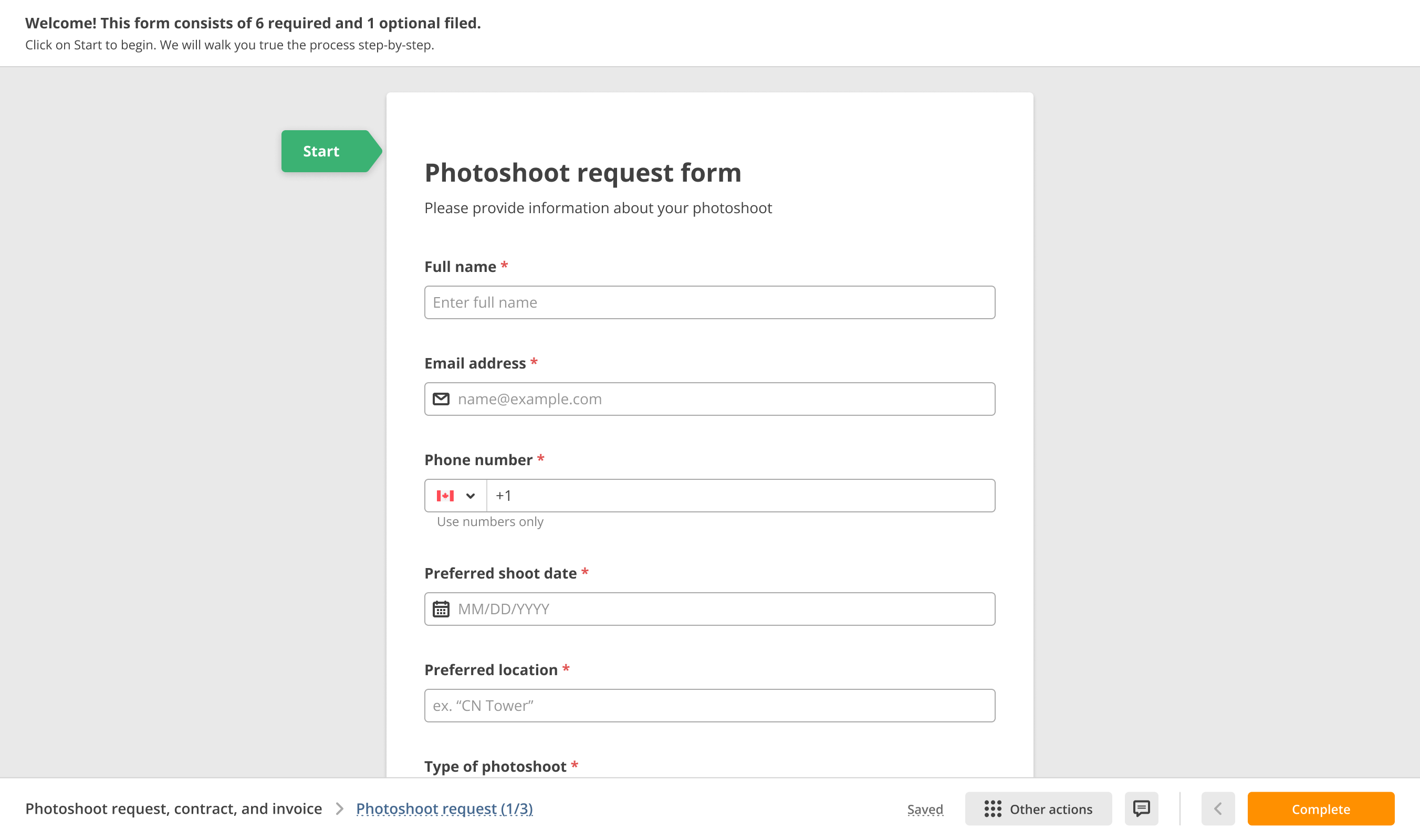
Original interface: opening the session 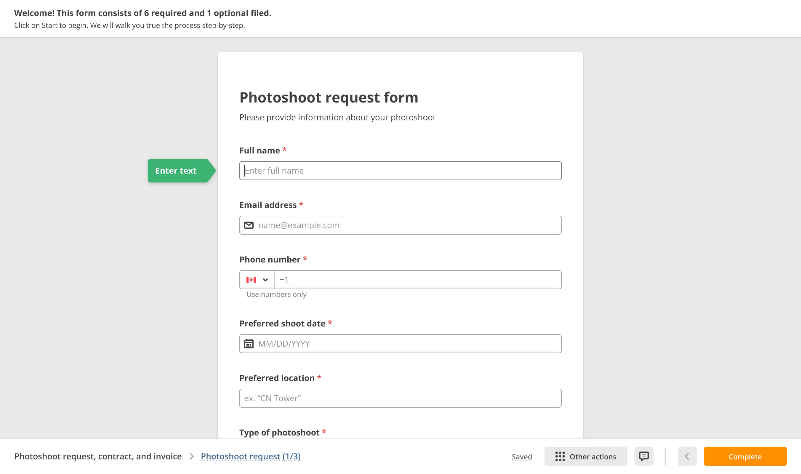
Original interface: entering a field 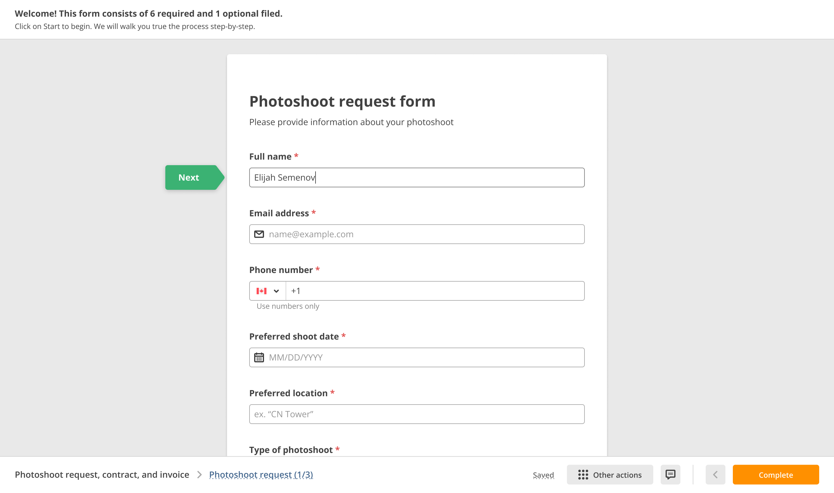
Original interface: completing a field
Explorations
Four goals came out of the interviews: cut cognitive load, make documents and fields discoverable, add branding, and give recipients a way to ask. We drafted more than 500 screens against them. The five directions below show how the hierarchy settled. At draft five we put a clickable prototype in front of the same people we had interviewed, and most of the earlier confusion was gone.
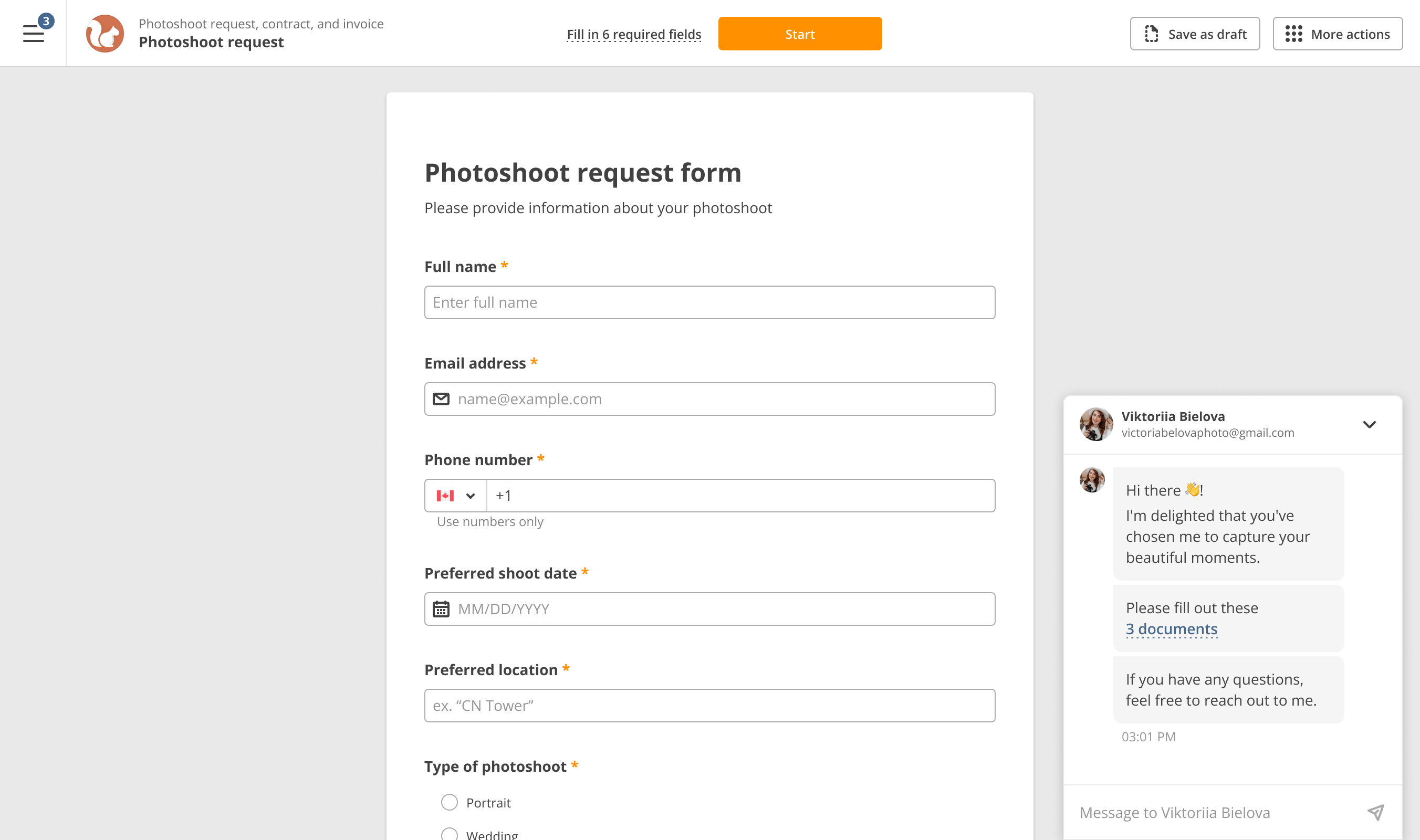
Draft 1: navigation and a channel to the sender 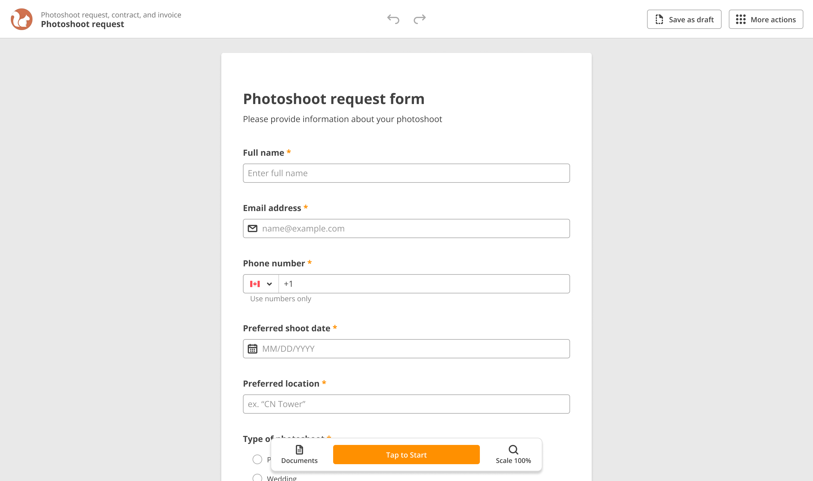
Draft 2: document layout 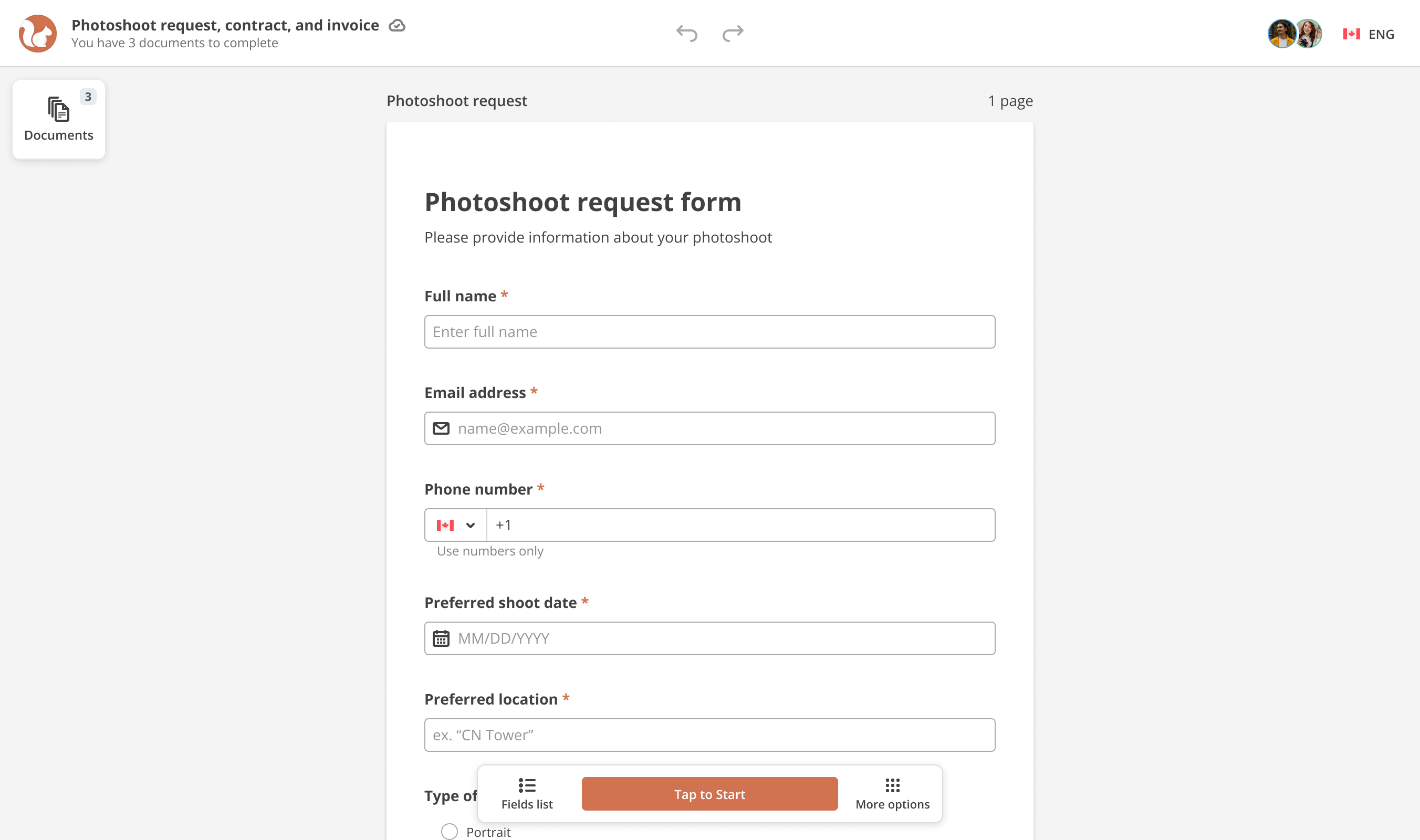
Draft 3: interface hierarchy 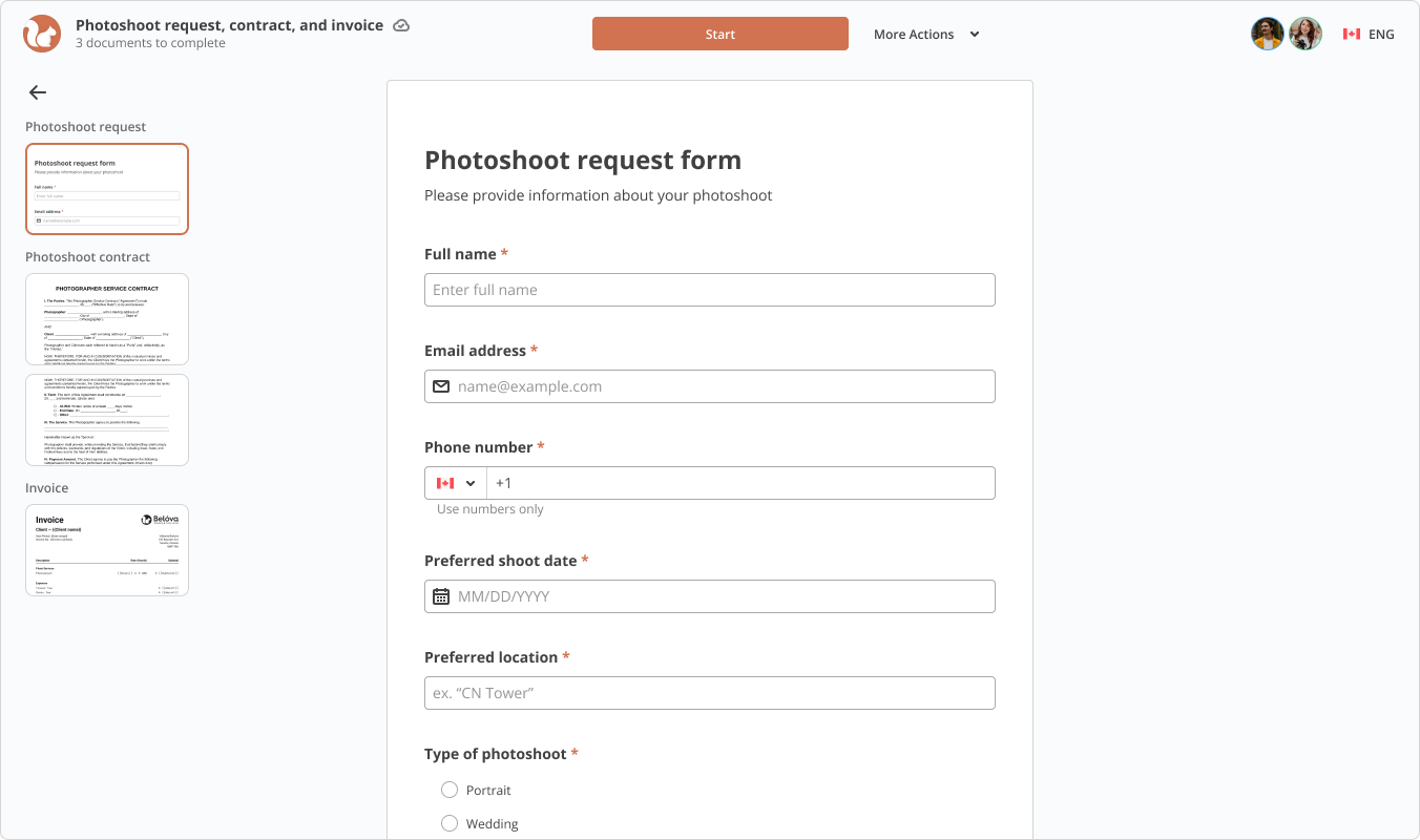
Draft 4: refining the controls 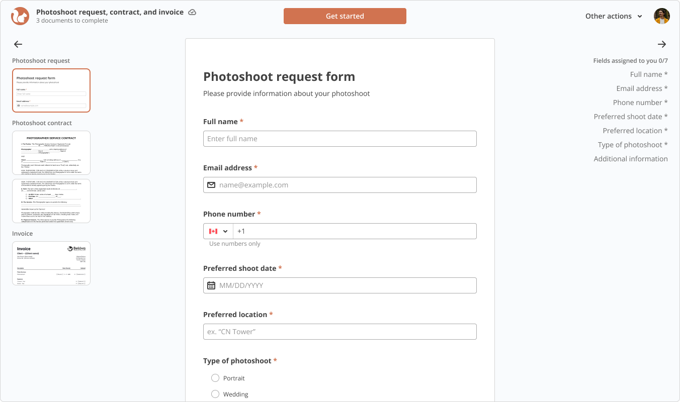
Draft 5: document list sidebar
Kept: a single header with the document title, language, and primary action; visible field counts and progress.
Dropped: the document-list sidebar from draft five, because the engineering cost outweighed what it added.
Replaced: the in-session chat from draft one with a reply-to address on the invitation email. One parameter instead of a messaging feature.
Solution
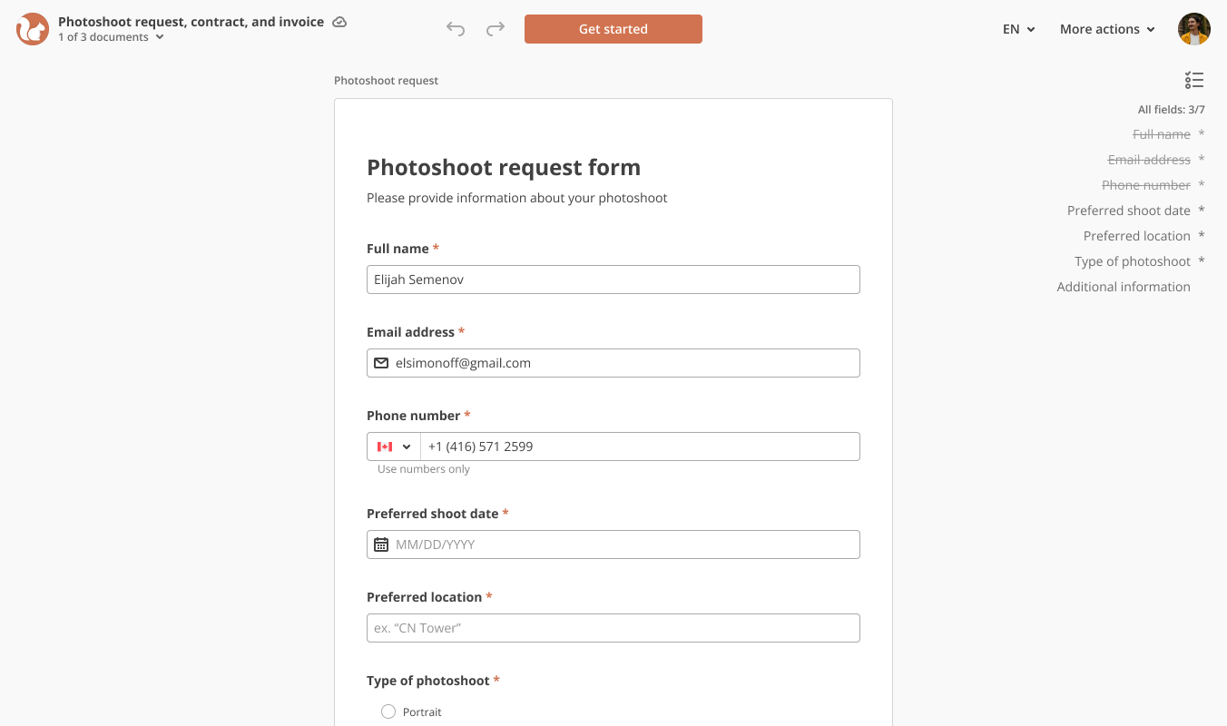
The header brings together the document title, language selection, and primary action. Required fields and completion progress stay visible as the recipient works through the document, from the first entry to the next document in the session. Companies add a logo and set accent, header, and background colors.
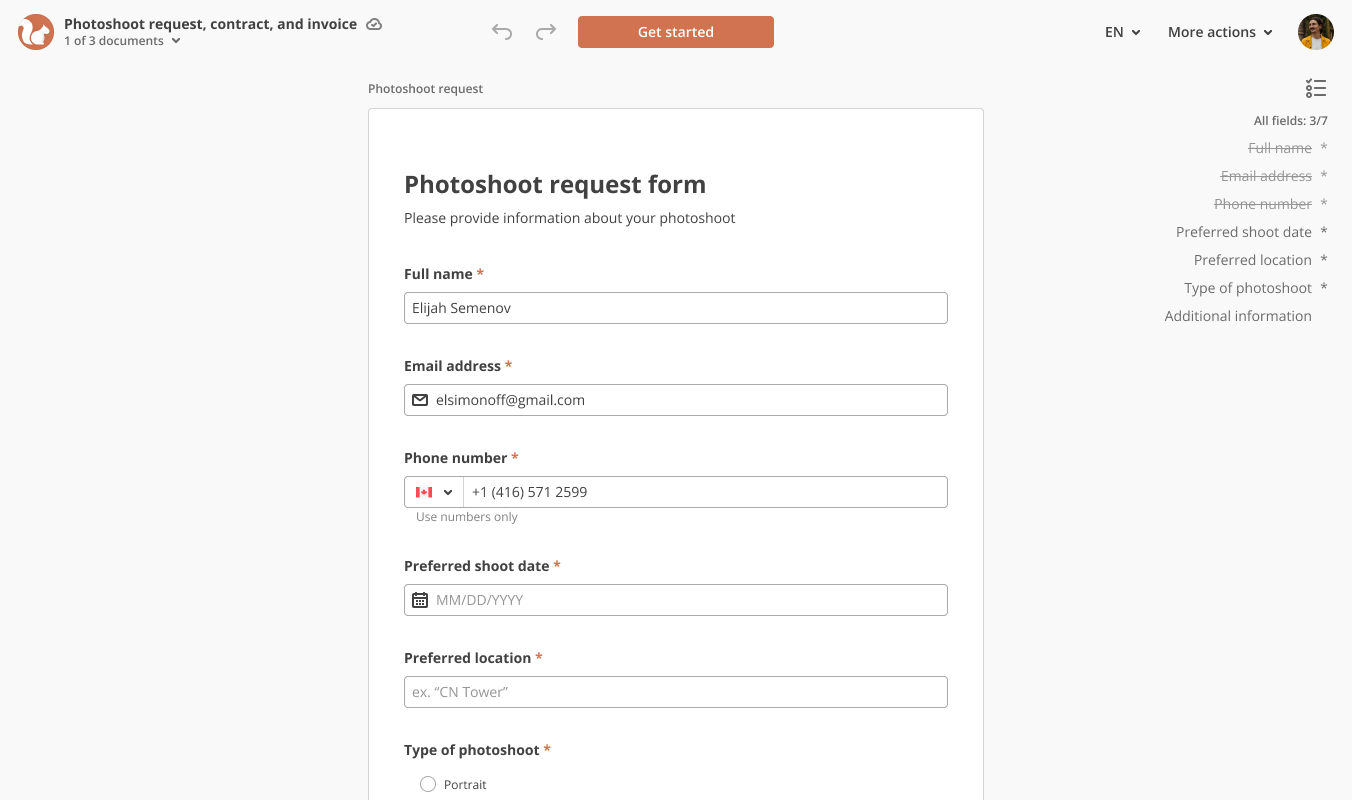
Opening the signing session 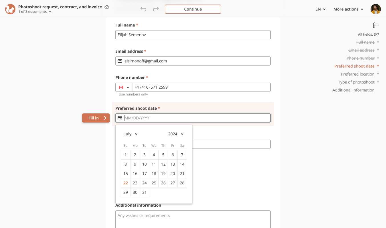
Entering a document field 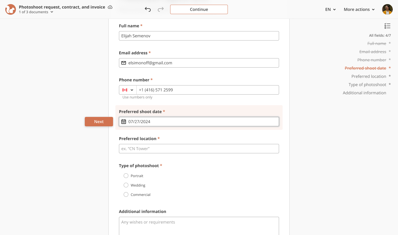
Completing the current field 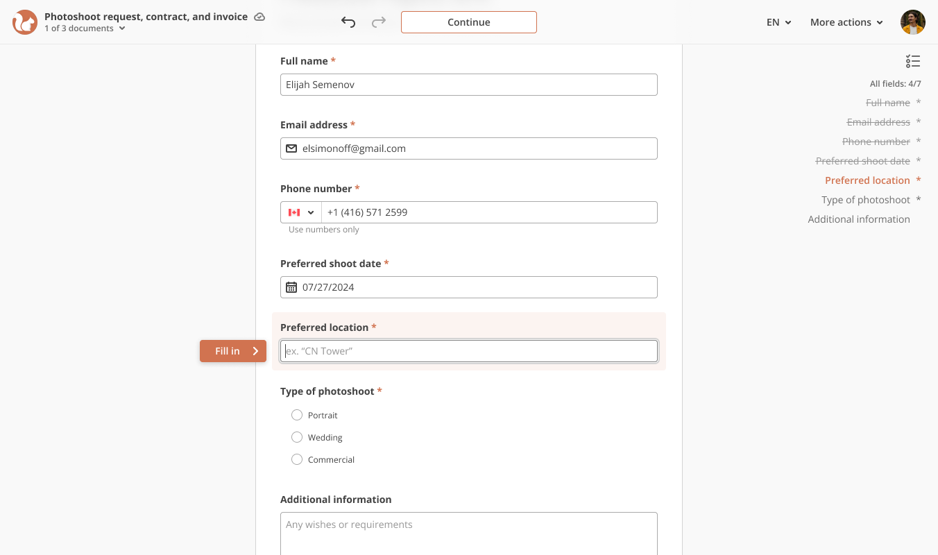
Moving through the remaining fields 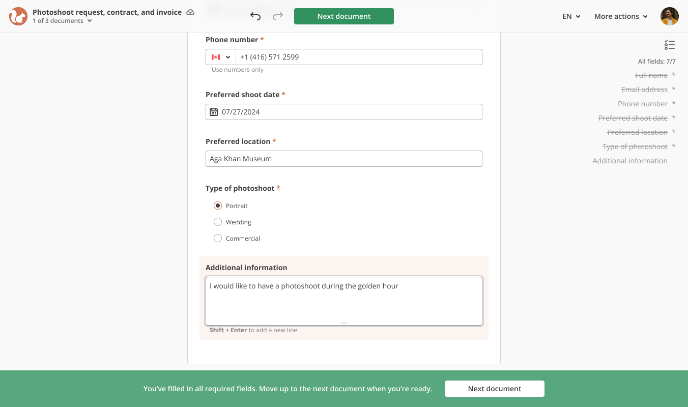
Ready for the next document
A focused layout. Fewer competing controls and a restrained use of color give the document and primary action more space.
Visible progress. Document names, field counts, and completion cues show what remains.
Familiar branding. A company logo and configurable colors connect the session to its sender.
Considered interactions. Reworked PDF fields, language selection, and saved progress support the steps between opening and finishing.
Mobile
The mobile session had to offer the same branding, field navigation, and document navigation on a phone. The most used controls, field navigation and the list of fields, sit at the bottom within thumb reach. The document takes the full width. Branding, document name, and the document list live in the header.
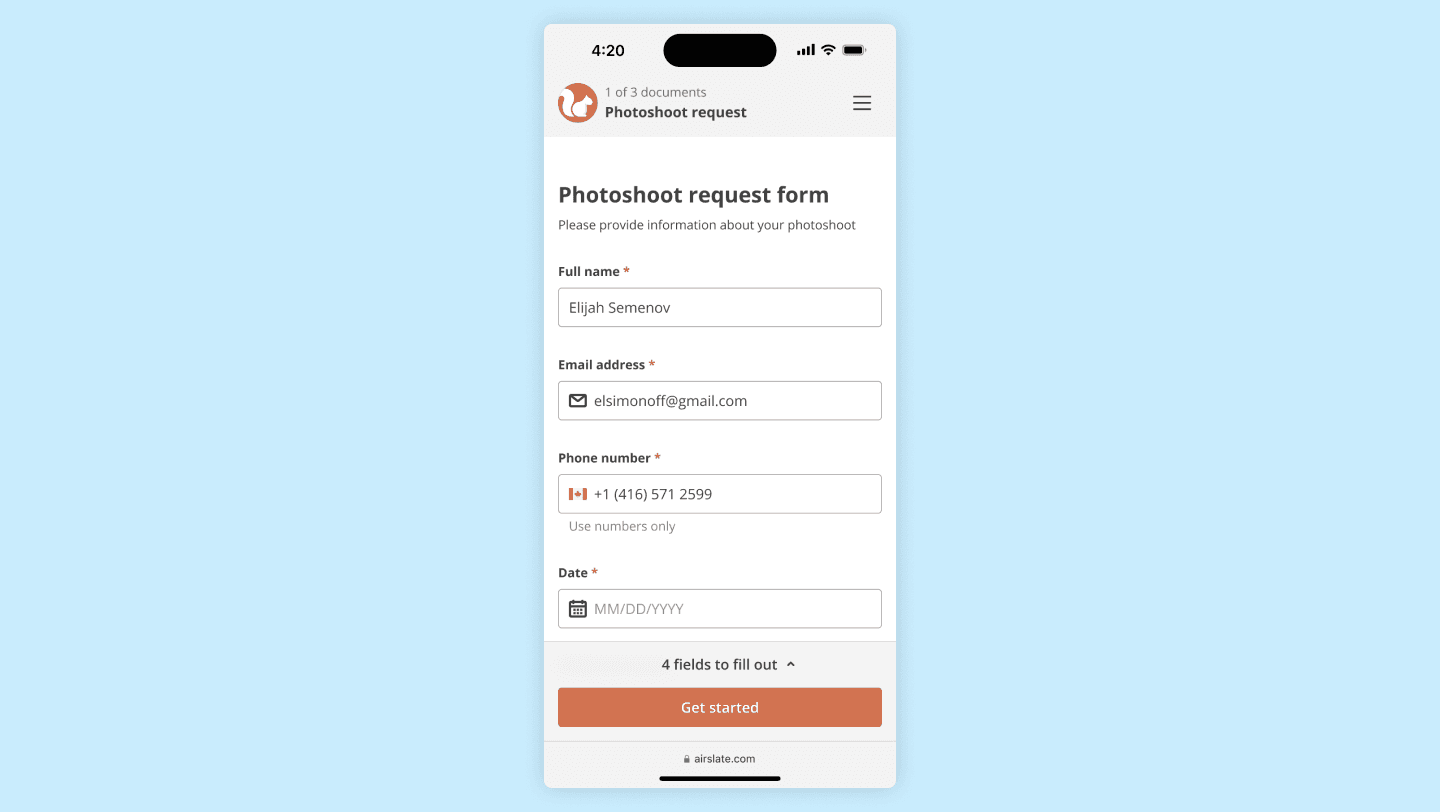
Mobile signing session start screen 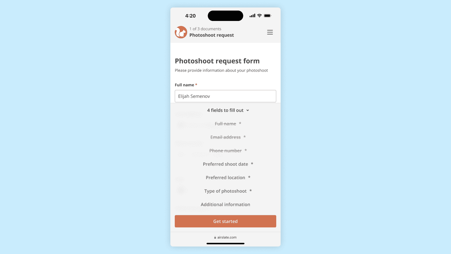
List of fields to fill out 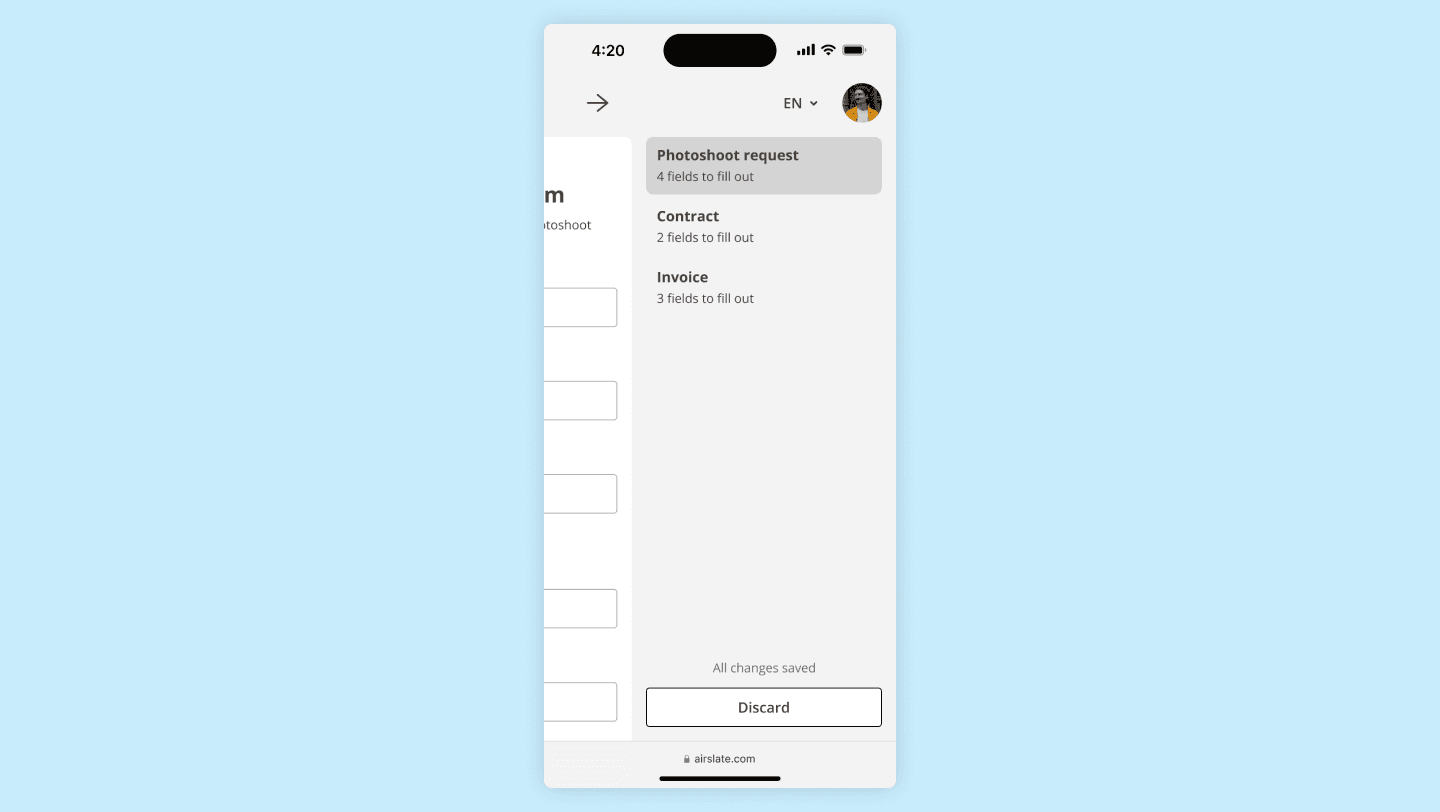
Navigation between documents
Web forms are native HTML, so elements resize and reposition for the small screen, and native keyboards, date pickers, and selection wheels do most of the work. Signatures and some date fields use custom controls.
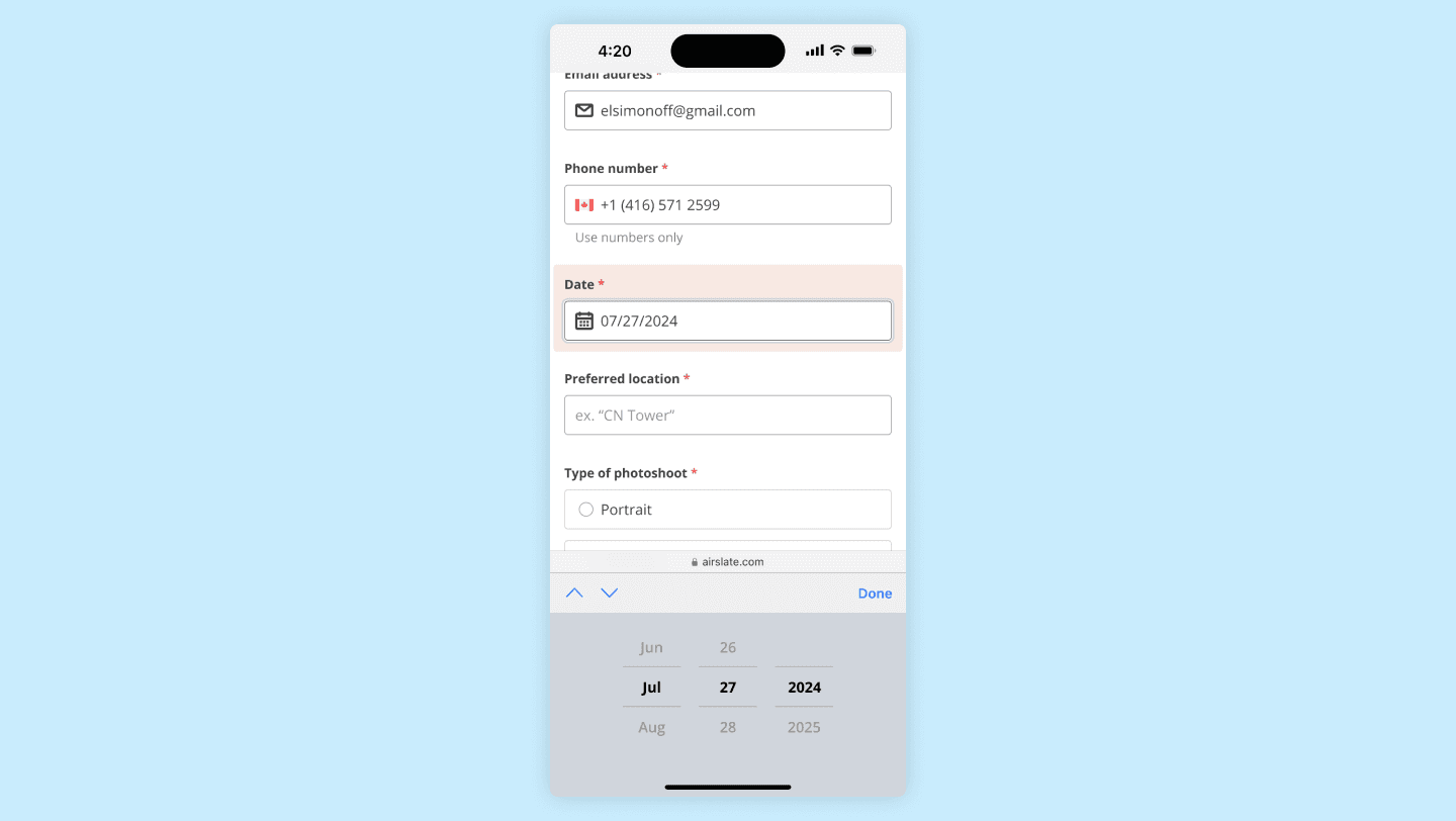
User is filling out a date field 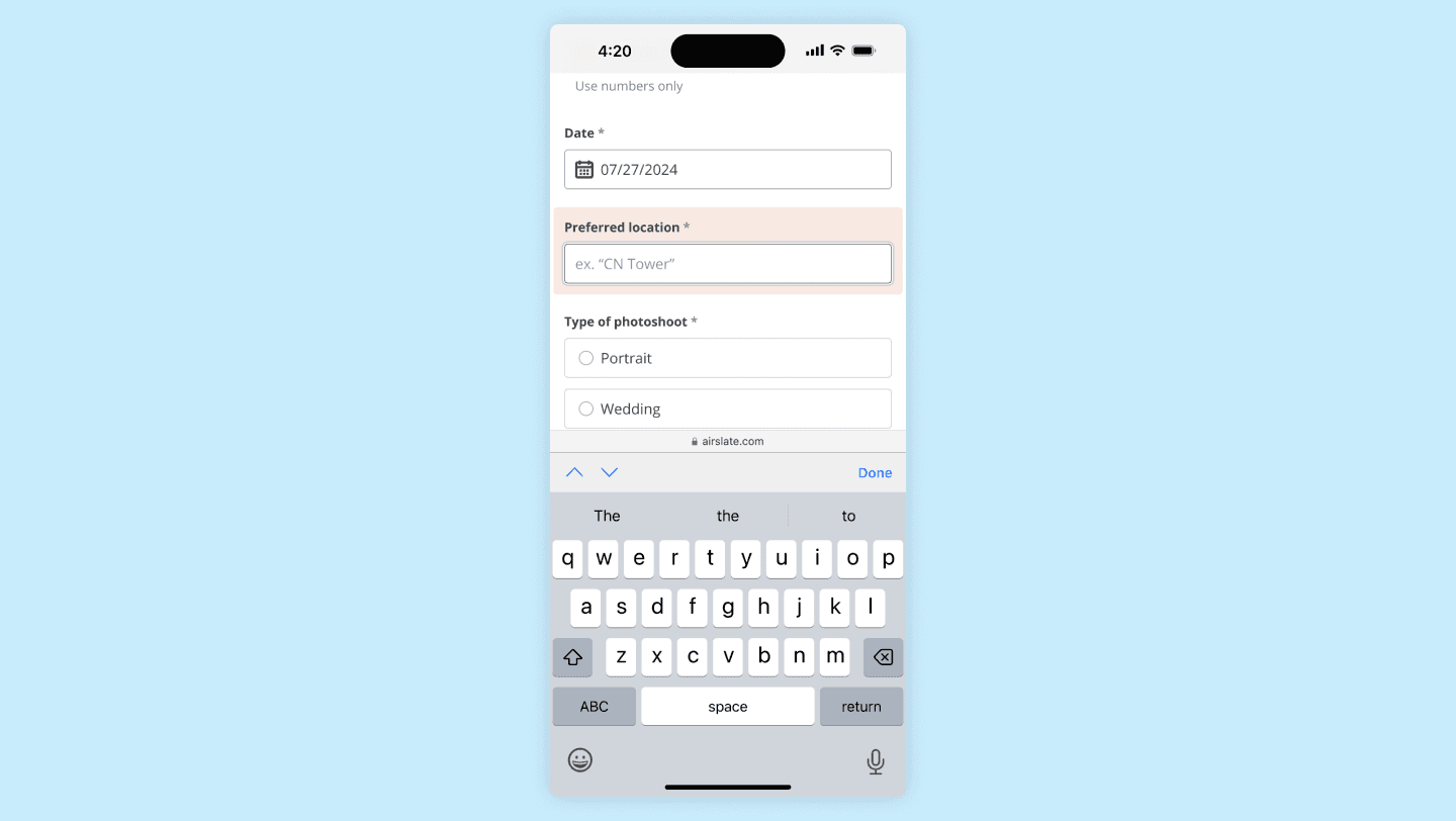
User is filling out a text field 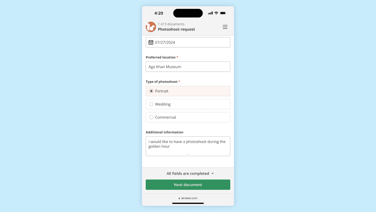
Completed document state
PDFs are digital paper, so they need zoom. Pinch works as expected, and focusing a field zooms the page until the field is 40 pixels tall and the text is readable. Research showed recipients do not distinguish document types, so the session looks the same across all of them.
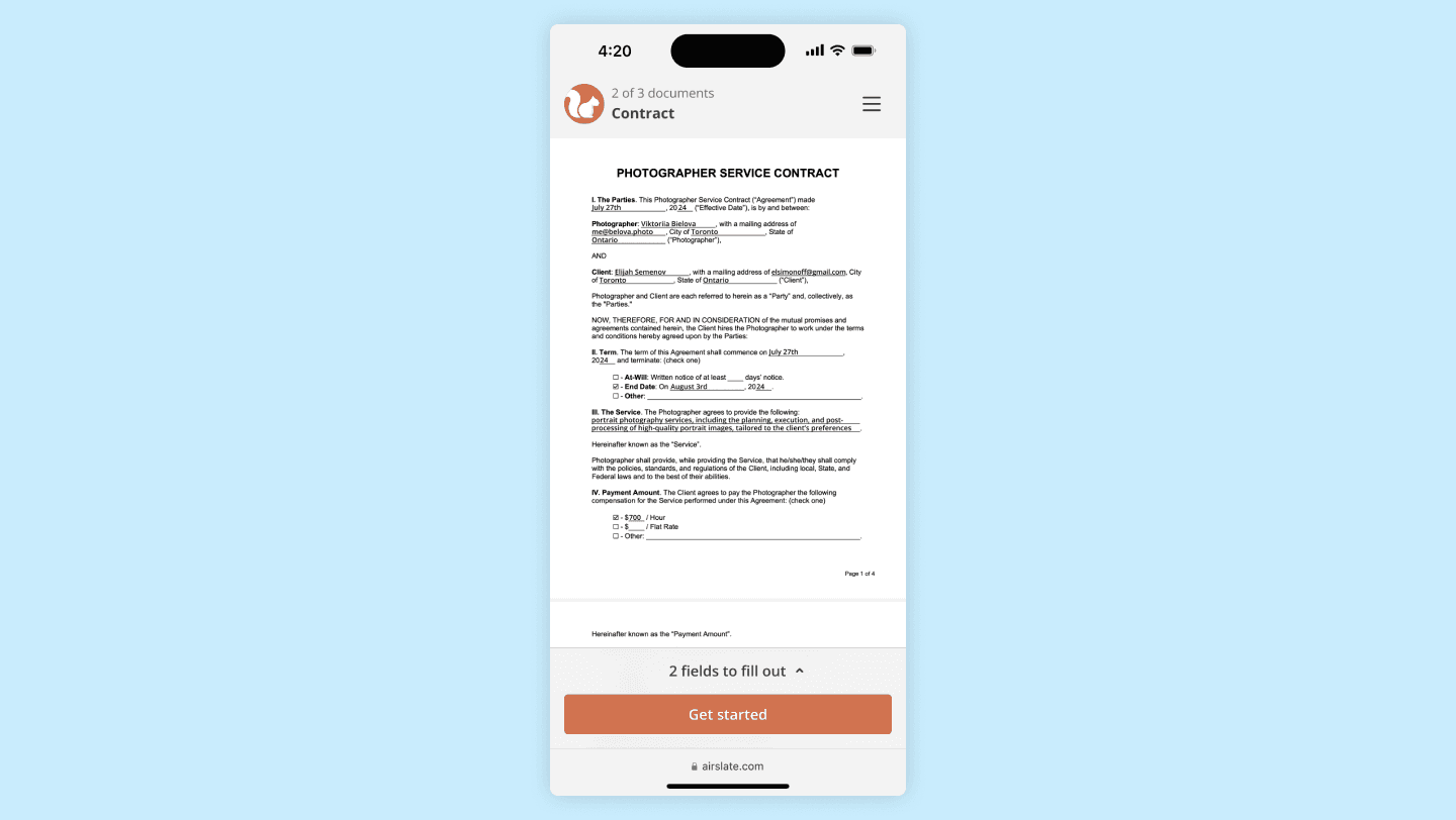
PDF signing session start screen 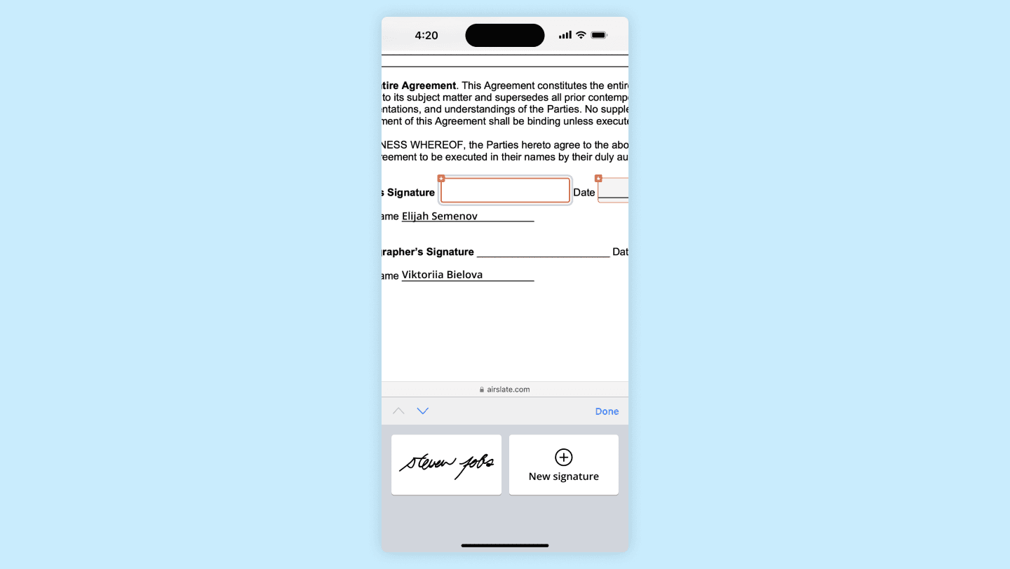
Zoom in on the signature field and signature keyboard 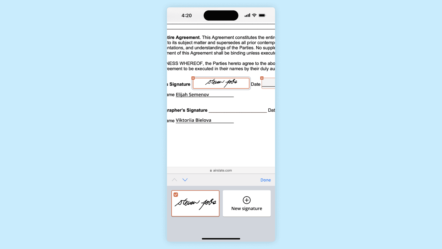
Filled signature field 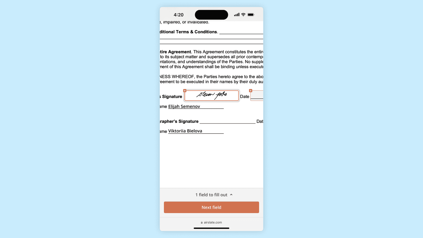
Navigation footer after user taps 'Done' and closes keyboard 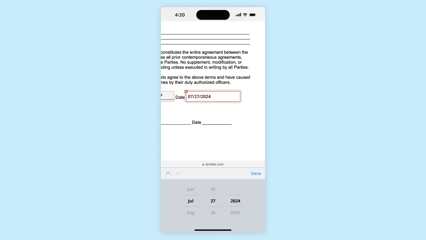
User is filling out a date field 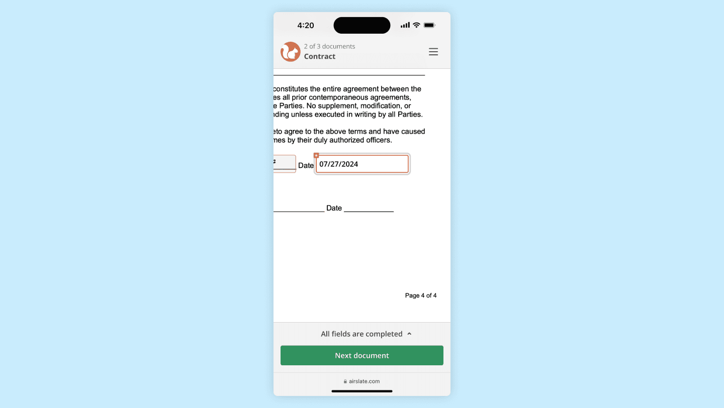
Completed document state
Results
We ran a month-long A/B test: half of new users saw the old session, half the new one. Only the signing session changed, so the effect on subscriptions is attributable.
Completion rate: +15%. Earlier signing experiments at airSlate, signNow, and pdfFiller had moved it 3 to 5%.
Free trials: +9.5%.
Paid subscriptions: +7%.
Reused: the same approach was applied to pdfFiller and produced similar results.
What I’d keep
Less is more.
No time estimate is a dealbreaker.
Branding is trust.
People need a way to ask.
Appearance moves the key metrics, not just the mood.