The patient profile is the page a pharmacist opens most. Every appointment, form, note and phone call in MedMe leads back to it, and it is where a pharmacist checks who they are talking to before a consult. In the old version that page was a list of consultations, with the patient’s details somewhere below.
A good analogy: a patient’s file at the front desk. The cover sheet should say who they are and what is coming up. The folders behind it hold the rest.
Where we started
The old profile had three panes. The left one listed every consultation the patient ever had, newest first, with the patient’s details pushed below the list. The right pane changed with whatever consultation was selected. There was no summary of the patient, no place for forms, notes or attachments, and nothing to tell a pharmacist what needed attention. Interviews with pharmacists pointed at the same problems.
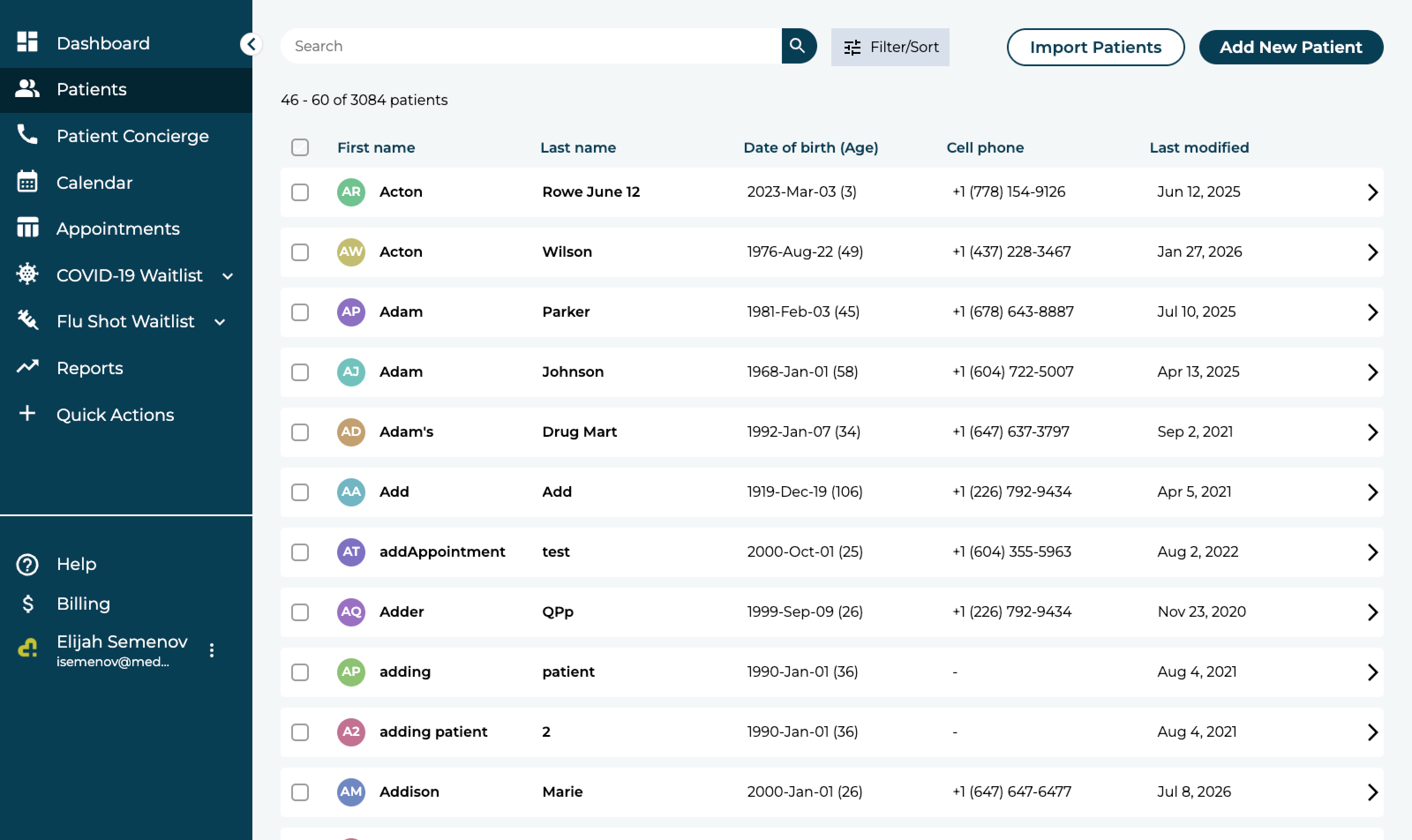
The old patients list 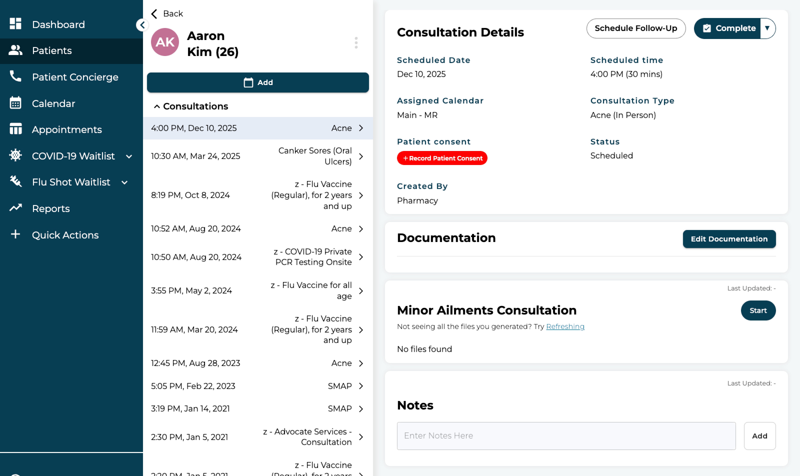
The old profile: consultations on the left, details below them, one consultation on the right
What we looked at
Before drawing anything we looked at how record pages work elsewhere. Salesforce cases, HubSpot contacts and NetSuite customers all lead with a summary, put related records in cards, and keep the long lists behind tabs. The pharmacy version had to add one thing those do not have: a clinical alert that is impossible to miss.
First concept
The first concept tested the idea in a lighter shell. The patient’s key details sit in a header strip. Appointments, forms and messages are cards with the latest items and a “Show all”. Notes and details share a tabbed pane on the right, and an appointment opens as its own page with a progress bar. The structure held up. The shell did not: it was a different app from the one pharmacists use every day, so the next round moved into MedMe’s own navigation.
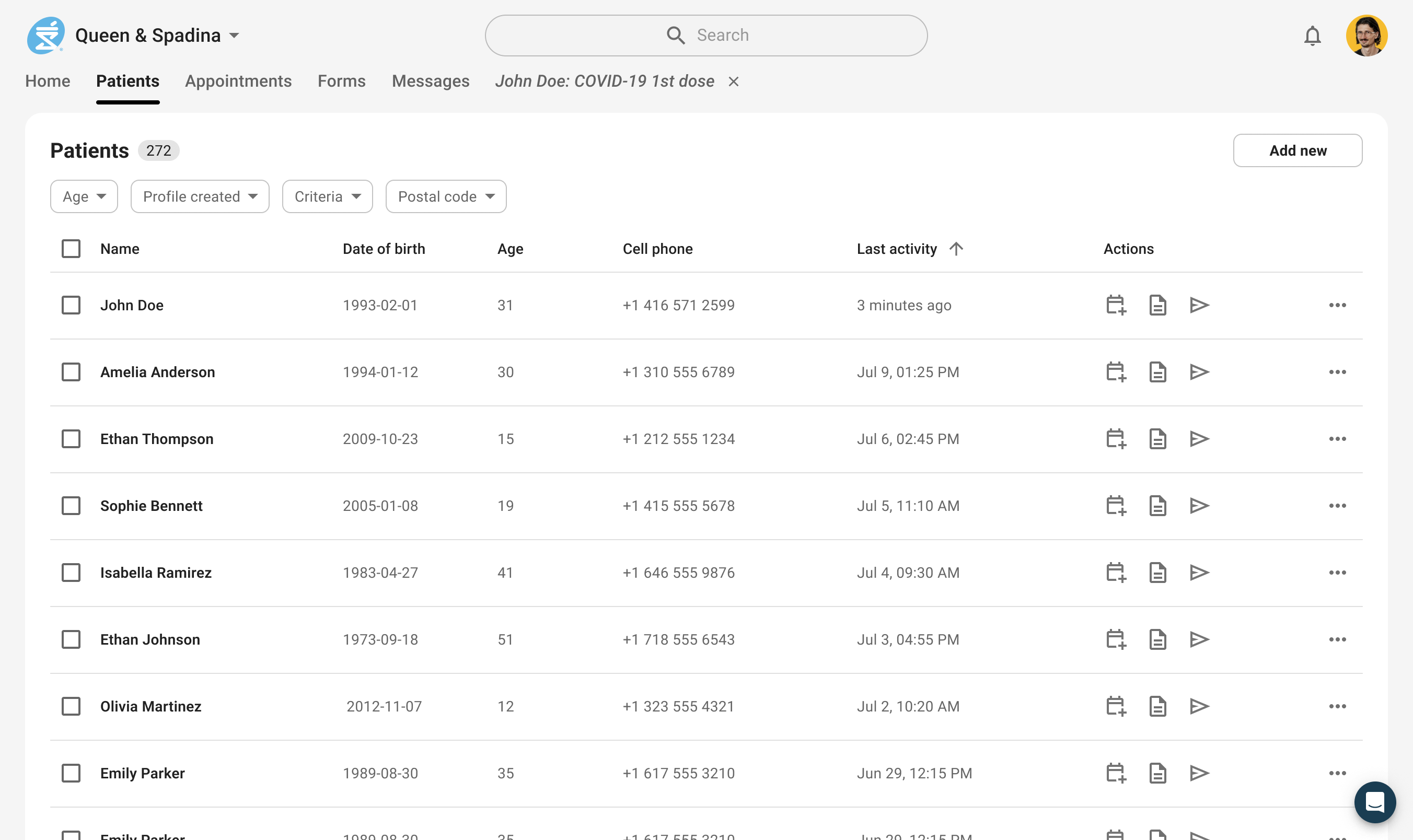
Concept: the patients list 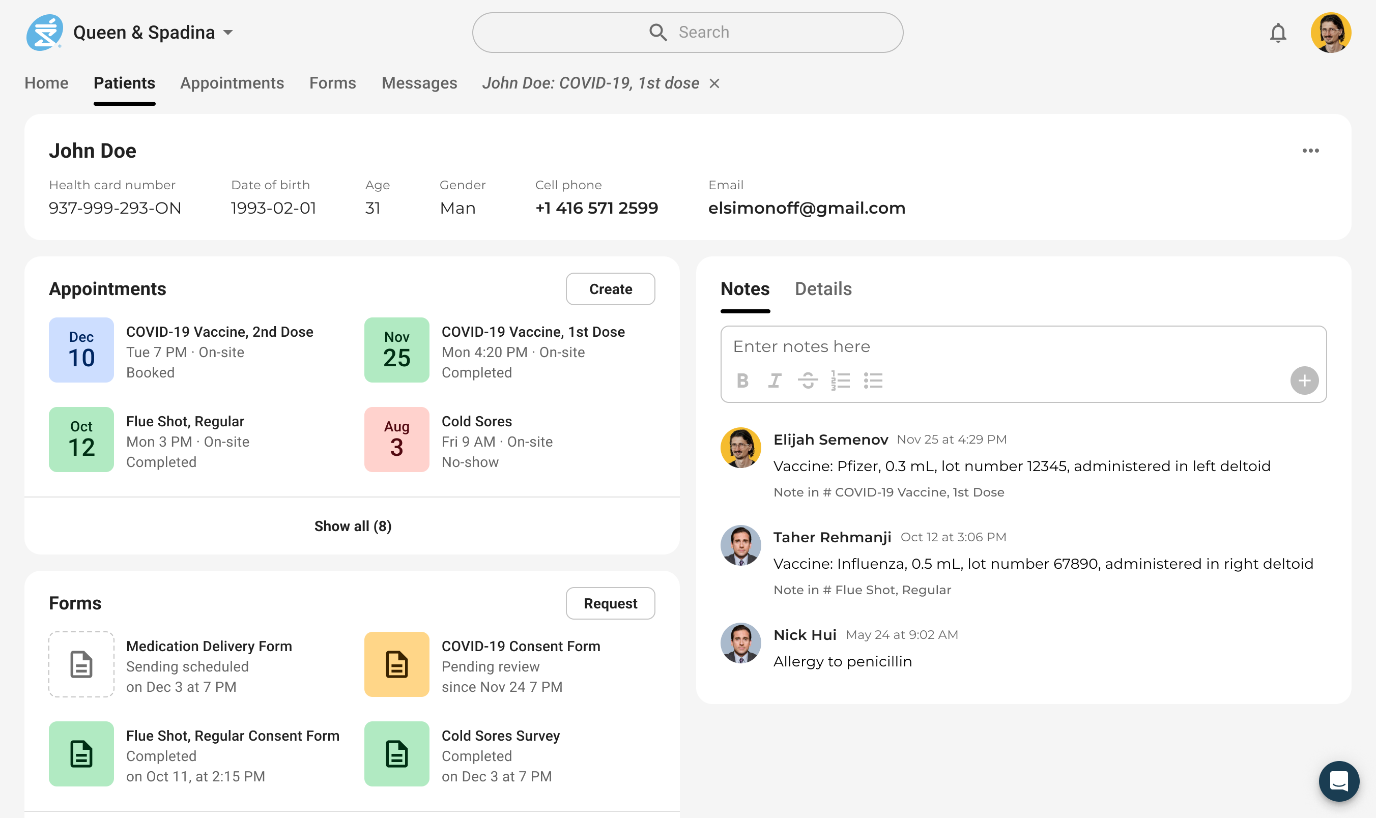
Concept: cards for appointments, forms and messages, with notes and details on the right 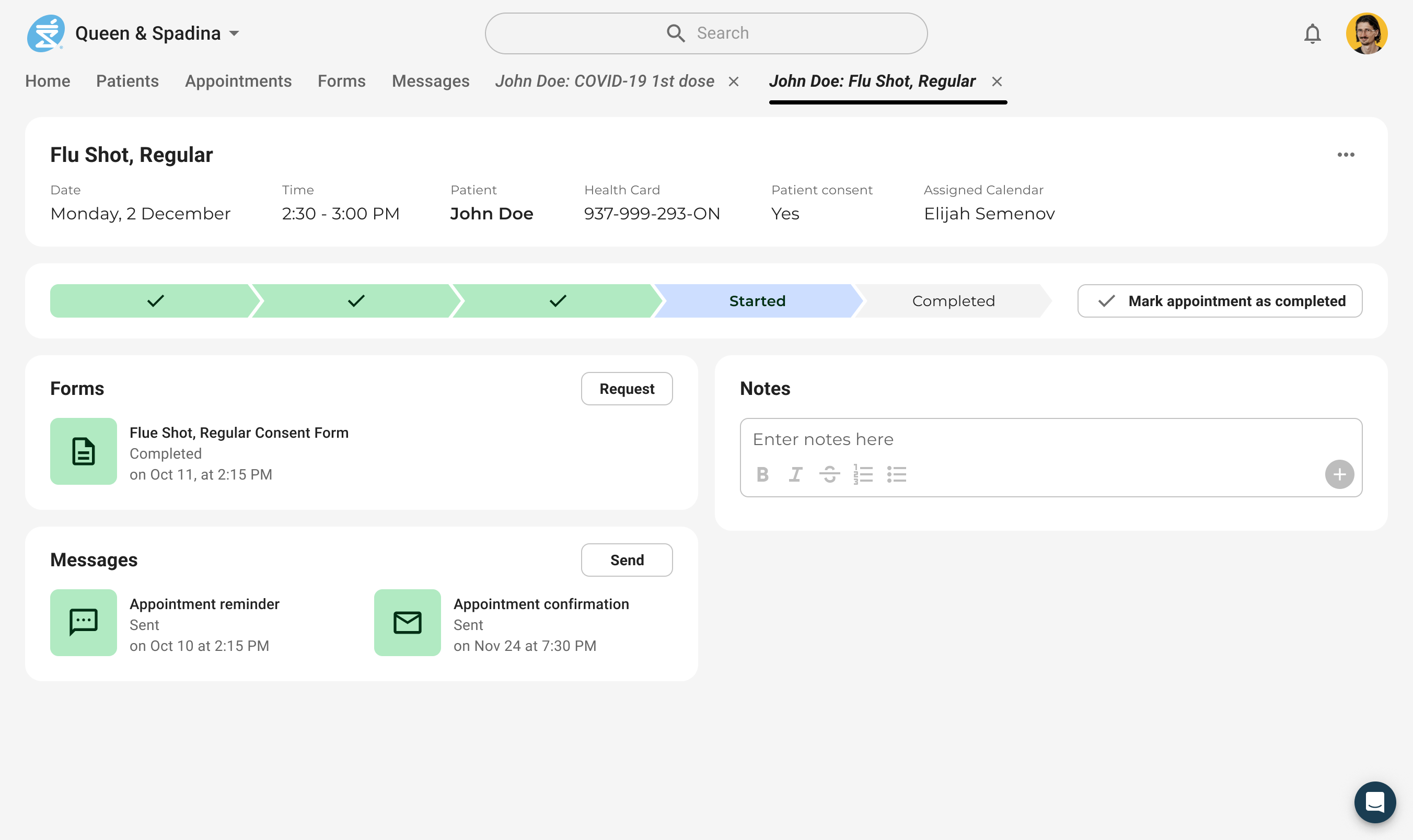
Concept: an appointment with a progress bar
Explorations
Inside the MedMe shell we tried the layout in several arrangements: two columns of cards, an activity log as a tab, forms as a filtered table, and the form itself opened inside the profile with AI Scribe beside it. Two things settled here. Tabs split the profile into Overview, Patient information, Clinical and Forms, so no page scrolls forever. Cards show three items and a “+N more”, which keeps the overview one screen tall.
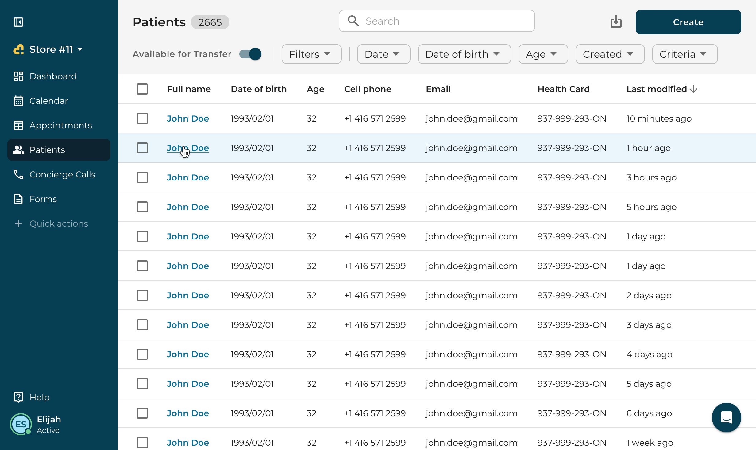
Exploration: the patients list in the MedMe shell 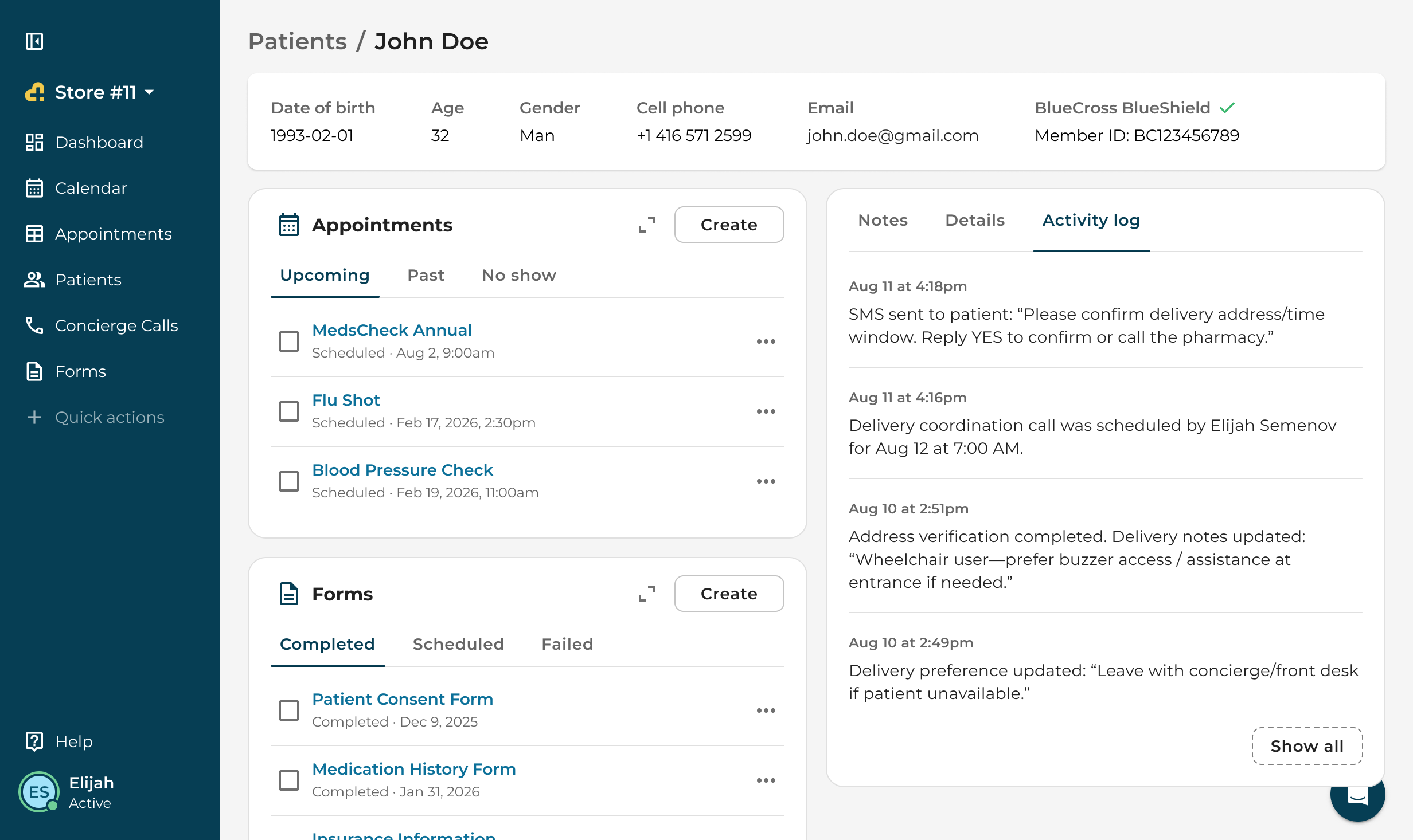
Exploration: an activity log as a tab 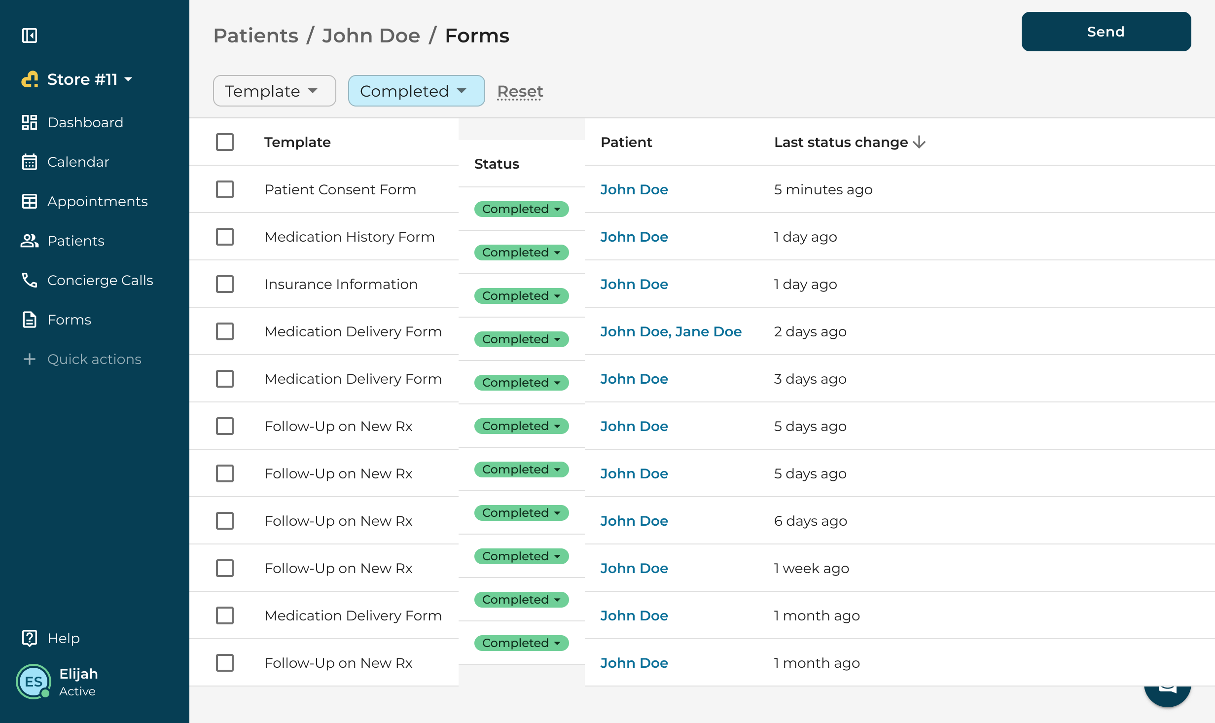
Exploration: forms as a filtered table 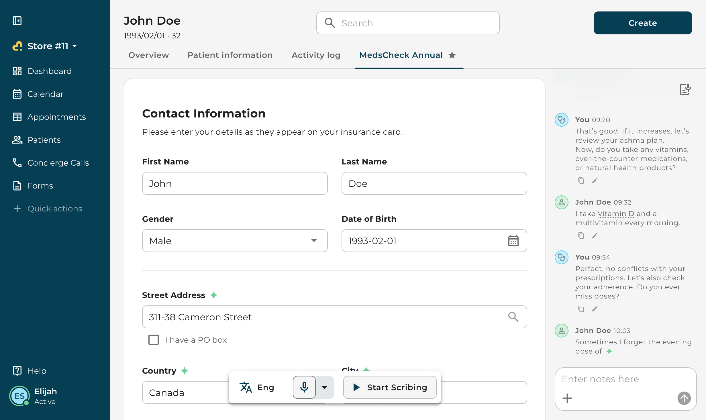
Exploration: a form opened inside the profile, with AI Scribe
The new profile
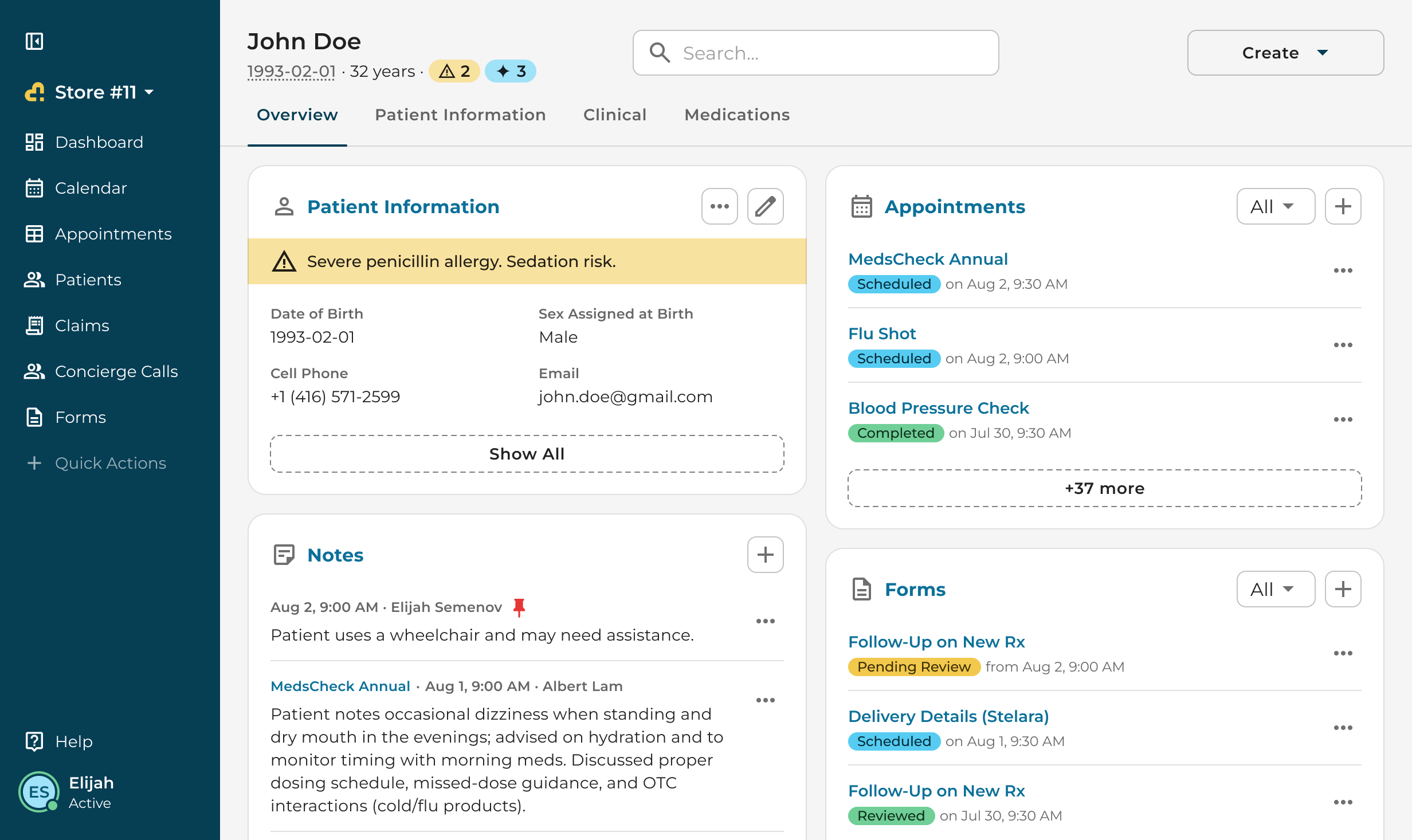
The header carries the name, date of birth and age, and two counters: alerts and pinned notes. An alert such as a severe allergy sits as a banner on the Patient information card, so it is the first thing on the page. Overview holds one card per record type: patient information, notes, insurance, appointments, forms, concierge calls and attachments. Patient information is the full record in cards. Clinical gathers medications, allergies, immunizations, history, measurements and labs. Forms is the table from the exploration, with status filters.
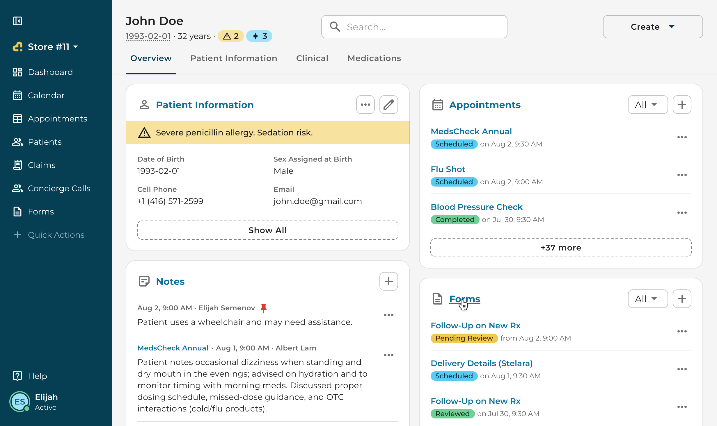
Overview, with the insurance card 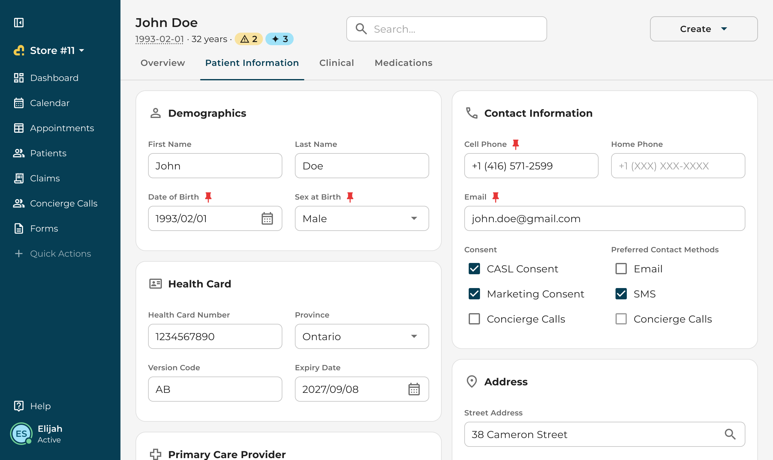
Patient information 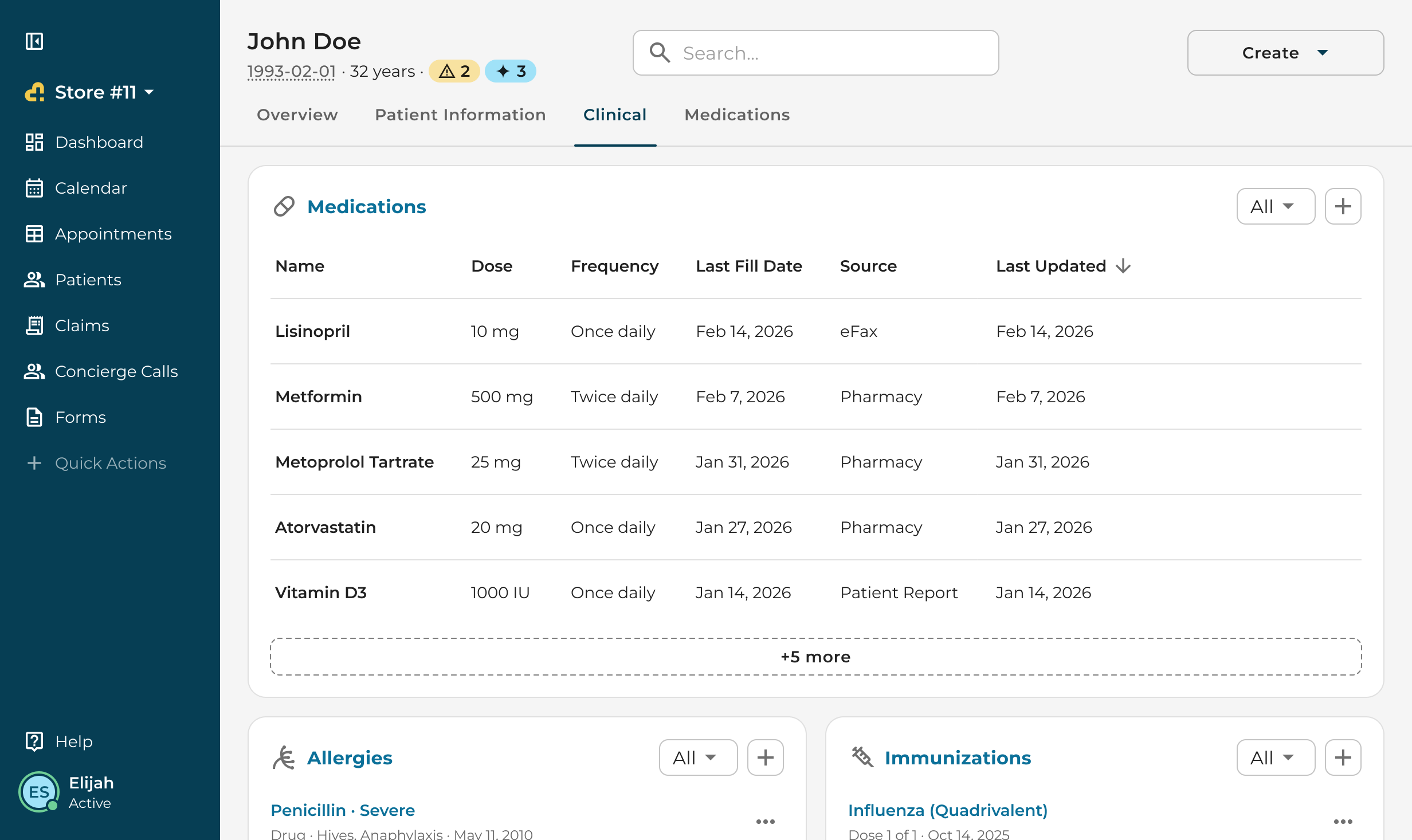
Clinical 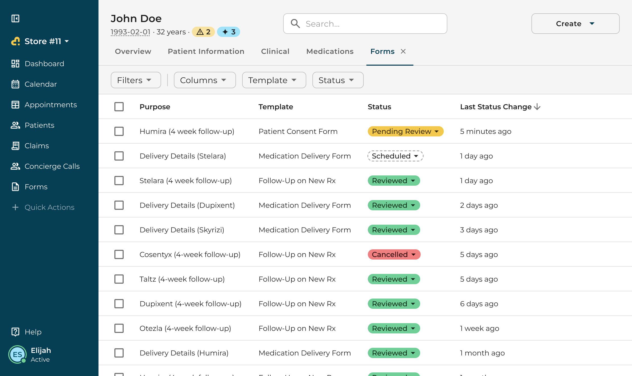
Forms
Appointments in the profile
Patients and appointments share the same list pattern, so a pharmacist can start from either side. Opening an appointment adds a tab to the profile instead of leaving it. The appointment shows its details, notes, documentation and attachments, with a Suggestions action next to the details.
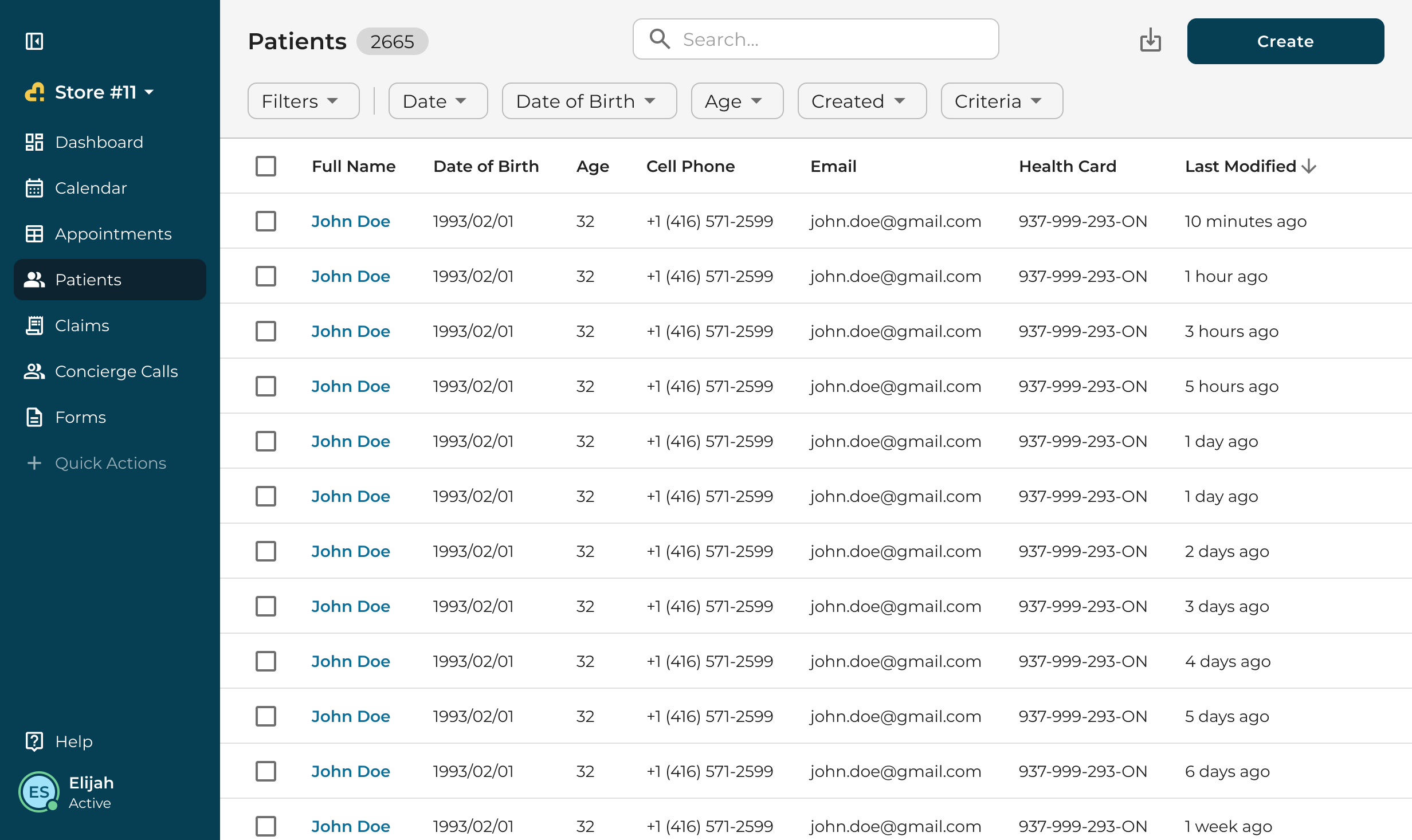
The patients list 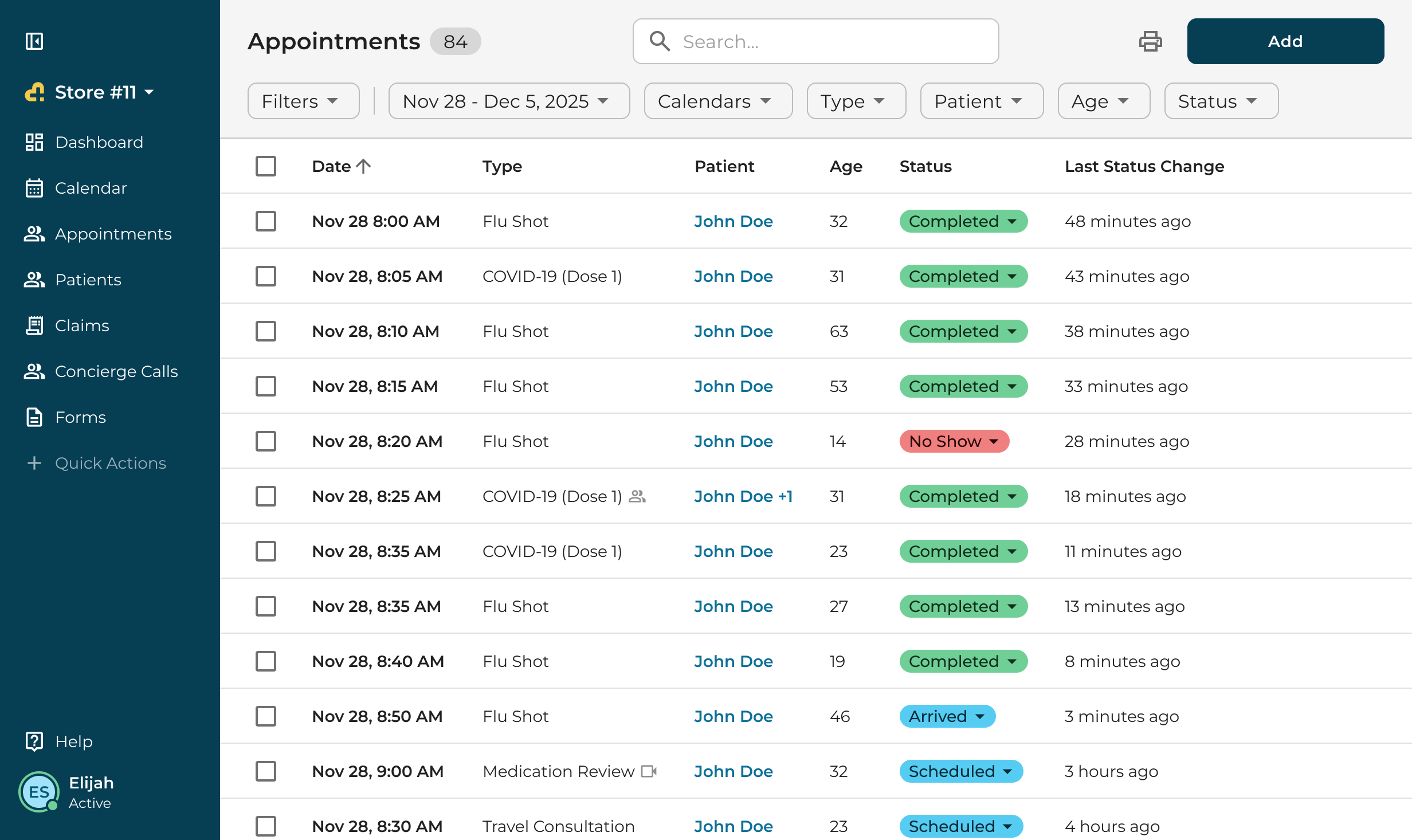
The appointments list 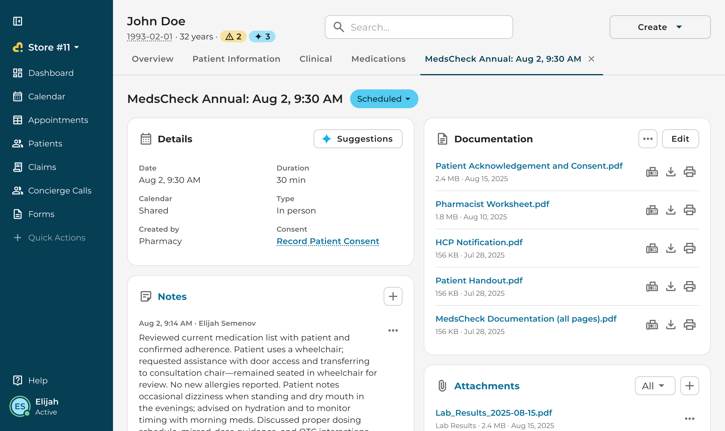
An appointment opened as a tab in the profile
Conclusion
The new profile shipped in 2026. What carried over from the first concept to the last screen is the shape: a summary first, related records as cards, long lists behind tabs, and alerts where nobody can miss them. AI Scribe opens inside the same profile, so a consult and its record now live on one page.